

Chrysalis: Let’s grow from Crisis to Confidence… Together.
5.2023-6.2023
Context: Coursera Course
My role: UX Designer
Chrysalis is a budgeting app for people in long-term crisis, as well as people who need visual ways to understand their money. It can be used by adults and children, and has a companion website. It’s purpose is to provide a visual representation of where you are putting your money in a way that is not overwhelming, is fully customizable, and shows you where your money is RIGHT NOW. Anxious about how much will be left in your account between the hours of the phone bill payment and your next paycheck? This is for you.

The Problem
Most of the adults I have worked with in service jobs struggle to organize their finances. This problem is multiplied if they have children. I have noticed several consistent traits:
They make so little money that they need to know paycheck-to-paycheck exactly how many pennies are in the bank.
Reading spreadsheets or anything that resembles a traditional financial system is anxiety-inducing.
Their stress level is so high all of the time that reading is difficult.

The Solution
An app that is constantly up to date and flexible with how you visually arrange your money. Similar to the envelope system, it also allows you to connect specific pockets to specific bills so that you can choose exactly where the money goes and set up an automated system for those “pockets” to be refilled.

The Goal
To make money not terrifying. Give people an easy and relaxed way to allocate their resources using a system that is constantly up to date and shows them how much money they have right now.
Secondary Goal: An app for adults to teach to kids to use as adults.
As I interviewed users for this app some asked for a child-friendly version so that they could teach their children to budget. This changed some of my design goals to include a child-friendly onramp where their budget can eventually be transitioned to an adult budget as they continue to use the app.
Personas helped me to keep in mind unique difficulties individual users might possess and barriers to entry they might experience.
“I’m not even sure if there’s enough money in my account to cover the phone bill.”
Gwen is a fiber artist who needs a fun way to budget because money gives her anxiety.

“Money is scary, debt is scary, bills are scary... but I want to have control of my life and not my life have control of me.”
Aisha is a mom and accountant who needs a creative kid-friendly way to budget because she wants to teach her daughter about managing money.
-
Family: Two older parents, sister
Occupation: Retail Employee
Age: 28
Education: BS Economics
Hometown: Boston, MA
Problem: Jackson is anxious all the time - so much so that he struggles to read important documents like bank statements or rental agreements. He works in an urban center making minimum wage, and has a two-hour commute each direction to get there.
Goals: To get his life in order he needs to at least know how much he has in his bank account without having to guess. With the cost of living combined with his low wages, every penny counts.
Frustrations: Besides everything, he sometimes overdraws his bank account. He gets so anxious he has difficulty reading the numbers on his accounts and sometimes the different deposits and purchases haven't sorted themselves out in time for him to know how much he can spend on groceries.
-
Family: Two lovebirds
Occupation: Installation Artist
Age: 32
Education: BA Fiber Arts
Hometown: Portland, ME
Problem: Gwen was never taught how to manage money, either in school or from relatives. Everything she knows she’s stumbled upon herself. She’d like to really clean up her financial life, but she is completely overwhelmed.
Goals: To feel like she’s in control of her finances. Make it so she doesn’t feel anxious every time she checks her bank account. Have a system that rewards her for putting in the effort to manage her money.
Frustrations: Most budgeting apps don’t make sense to her and feel like they were designed for a different brain. Budgeting is overall overwhelming. Getting apps to connect to her bank account and be accurate is frustrating when banks don’t update her account until the end next day.
-
Family: Husband, 7 y/o daughter
Occupation: Student
Age: 42
Education: MBA
Hometown: Chicago, IL
Problem: Aisha’s brain has always worked in a clear linear fashion, but she knows this isn’t the case for all people - including her daughter. She’d like to star. teaching her daughter values around money and prepare her for a life of successful financial management without being taken advantage of.
Goals: To teach her daughter how to budget. Make budgeting money fun for her daughter. Make sure the lessons are long lasting.
Frustrations: Aisha understands how money works but she has trouble teaching her daughter without the right tools. She hasn’t found a money app that works for both her and her daughter.

“Being able to budget can save your life. I want to introduce my daughter to budgeting concepts while she is young so that when she is an adult she has a firm grasp on her finances.”
Jackson is a retail employee who is constantly stressed about how much money is in his account.

A competitive audit showed me the market is lacking in this niche.


Qube’s “cube” system is the closest to the “wing” system I designed.
Mint has some flexibility around renaming categories, but doesn’t allow you full customization.
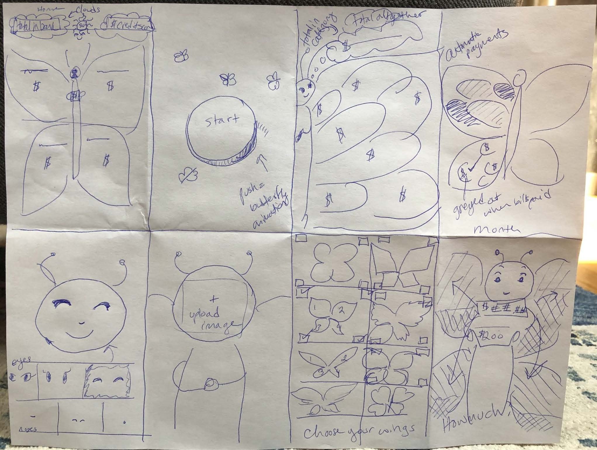
Initial designs show the different ways in which the app is interactive and customizable for each user.


Money categories can be physically rearranged, renamed, added, and deleted.
There is visual representation for how full each “mini bank account” is so that you can choose to add or remove money from it.
The menu contains resources to help users make decisions around how to manage their finances as well as more detailed ways to customize their experience.
A usability study showed that my prototype was intuitive but needed some tweaking.
Parameters
Unmoderated Study
5 Participants
Remote
10-15 minutes
Findings
Make the body of the butterfly a thermometer along with the wings
Allow for automatic payments to go through and show up as part of the budget
Make sure different parts of the app have both a visual cue as well as text
A sitemap showed me how each segment could be further customized from a desktop.

I created designs for multiple screen sizes to clearly lay out the user experience for each one.


Try out the prototype!
Having trouble with the embed?
Key Takeaways: Budgeting for Creative Brains
I have more fingers on one hand than the number of times I’ve heard from someone (who doesn’t specialize in finance) that they are not “good with money”. We experience all sorts of social and cultural pressures around how to spend or not spend it, and that doesn’t help. A few money books in and I began to wonder if maybe there are two problems.
Would it be helpful for people to organize their money deliberately according to their values (instead of compulsively spending according to their values)?
What if it could be organized in a way that makes more sense for creative brains, or brains that just don’t operate along the same linear lines as spreadsheets?

If I were to continue working on this project, I would…
User study: Parents and kids. Do a follow up research study on how children interact with the product both with and without their parents assistance in exploring the app. Create consent forms and make sure study is via zoom to ensure safety of minors.
Expand designs of butterfly wings to encompass a variety of audiences, especially those not typically drawn to butterflies: i.e. design wings that look like they come from FPS games or post-apocalyptic war zones.
Iterate on categories and explore more tools users can use to figure out what they want their categories to be called and learn more ways to think about money.
I felt like I was trying to invent the wheel for the first time, so while the process of designing this was challenging it was also rewarding.
There is a similar product on the market in the form of Qube, but most of the market is pretty empty of similar products, so inventing something from the ground up proved challenging.
“I need this for my kids.” - User
“I need this for ME.” - User
I got incredibly positive feedback from the users I asked to test drive the product. This is something I truly wish would be picked up by a financial institution because I would love to continue working with users to improve their experience dealing with finances.